Search Results for: behind the design

Behind the Design of a French Country Themed Kitchen with Alma Homes

In today’s Behind the Design, we sit down with Kirsten Erickson of Alma Homes, a design-build firm based in Orono, Minnesota, specializing in high-end custom homes and remodels.

Here, we focus on the Lake Loft kitchen project, Kirsten’s home, which exemplifies the French Country design style with its soft neutral tones and rustic details. Read on to learn how Kirsten and the Alma Homes team brought this style to life.

Tell me a bit about Alma Homes and your role.

My name is Kirsten Erickson, and I’m the founder and principal designer of Alma Homes. I bring a trained architectural eye and an interior design background to the world of homebuilding. I received my undergraduate degree from the University of Minnesota – Twin Cities – where I majored in architecture with minors in housing and construction management. After completing my graduate studies at the University of Colorado in Denver, I returned to Minnesota where I worked for a couple of builders before making my dream of starting Alma Homes a reality.

Being a boutique builder, we intentionally take on fewer projects each year, so there’s more time to focus on our clients. As a design-build firm, we act as a one-stop shop in the homebuilding journey, which creates a very streamlined process. Before designing a home, we take the time to get to know our clients and understand how they live. This knowledge helps us create a home tailored to their lifestyle.

What is the first thing you or a client generally select when designing a kitchen?

The first step to any kitchen design process is to define a general look. We don’t get hung up on handle styles and paint colors until we hone in on the style—modern, transitional, traditional, etc.

What inspired the Lake Loft kitchen space?

The Lake Loft’s gorgeous finishes are abundant, many influenced by our travels abroad, with European oak hardwood floors, reclaimed timbers, and antique accents that include doors and windows imported from France. The Lake Loft kitchen brings the French Country style to life.

What are the core qualities of a French Country kitchen design?

The French Country style tackles the seemingly impossible task of marrying together rustic elements with intricate and elegant details. A few core qualities of a French Country kitchen design include intricate cabinetry details that sweep the eye upward. Another key characteristic is the soft, muted color palette (we love our creamy beiges). This style also utilizes raw, rustic materials like stone walls and exposed wood beams. We can’t forget that a generously-sized island is practically a must-have in French Country kitchens, as it invites families and guests to linger over good food and conversation.

How do you go about selecting appliances that fit into a French Country design?

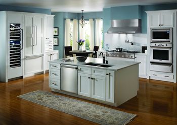
Panel-ready design effortlessly brings the French Country look to fruition, allowing refrigerators and dishwashers, amongst other appliances, to appear as integrated parts of your cabinetry and countertops. For this reason, we went with Thermador Built-in Freedom® Refrigeration.

We tend to select freestanding ranges for French Country kitchen designs because they capture that French culture look and create a presence in any space. In the Lake Loft, we selected a Thermador Dual Fuel Pro Grand® 48” Professional Range for its bold look and timeless craftsmanship.

Is this a style that you are seeing trending?

We focus on creating timeless spaces that reflect our clients’ styles more than we worry about what’s trending. Trends are fun to incorporate when they are congruent with what our clients are looking for. We have loved the resurgence of the French Country style making its way back into homes, which includes natural wood tones, especially white oak, and a warmer palette of neutrals with rich undertones.

What was your process in bringing the French Country look to life in the Lake Loft?

Luckily for us, the Lake Loft is our home, so we truly got to design the spaces around our family. When we’re working with clients, we spend a lot of time understanding how our clients live and their design inspirations. Our goal is to bring their personalities out in the design, and not force design ideals on them. This allows us to create a home that complements their daily habits and finish it in a way that exudes their style. We pair that with quality materials and construction practices that will stand the test of time. We enjoy building a wide range of styles, as it keeps our team on our toes!

Anything else you’d like to share?

Our team is developing educational courses that launch in the next couple of months, where we will deep dive into topics like building, remodeling, and design. We invite you to join us at www.almahomes.com to preorder and be the first to know when the courses drop.

For more design inspiration, visit: https://blog.thermador.com/category/design-2/.

Behind The Design: Creating a Cohesive Kitchen Design with We3 dwellings

This is an exciting one! In today’s Behind the Design, we sit down for a one-on-one chat with Christina Long – one part of We3 dwellings – to discuss what makes a cohesive kitchen design. She represents her small team of three, including husband, Jay Long, and their business partner, Joe Dodrill.

Let’s dive in for a behind the scenes look at this beautiful Thermador Blue kitchen – the Oakdale remodel!

Tell me about you and your role at We3 dwellings.

We3 dwellings is the creative collaboration of two companies – L&D Construction and JLW Design. With three design driven dreamers, two successful partnerships, and one vision, We3 strives to innovate and slightly disturb design in the housing industry.

Design has always been a part of me. When I was younger, I was always driving my parents crazy with wanting to rearrange/redecorate my room. Design is truly my passion, and I am thankful to get to do what I love every day!

It was not until after Jay and I were married for a little while that I began to get to do what I loved and make a living while doing it. Our collaboration to create JLW Design is something that is truly unique and magical. We have been creating magic for others and ourselves since 2012.

In 2019, we had the opportunity to join forces with our best friend, Joe, and create We3. We3 is what it says in the name. You are always getting the best of all three of us as we approach each project together, creating a space that you will enjoy for years to come. While we all have different tasks each day, ultimately all three of us touch each project and mold it to become the best version of itself.

To be specific about my role, I am the lead interior designer and one of the general contractors. I have the honor of working with my life partner and best friend each day and love getting to create magical spaces with them for our wonderful clients!

How do you begin the design process for your clients?

After our initial introduction with our client, whether through phone call or email, we then send them our New Client Questionnaire. This questionnaire gathers the necessary information like address, budget, requested areas of renovations, etc. From there, we set up a time to meet the client onsite and walk though their goals for the renovation. At this meeting, our team of three meets with the client to create the vision together before heading to the drawing board to come up with a realistic design time and cost and send to the client for approval. Upon approval, we start the process of combining the client’s vision with a realistic design plan that meets everyone’s goals. Once the design has been approved, we draw up a cost for construction and a general timeline for the project.

From your perspective, what makes a cohesive kitchen design?

A cohesive kitchen design is one in which design and function are parallel, where the two are so integrated that you don’t notice which comes first. It can be an interesting and sometimes complicated task to accomplish.

The kitchen is the heart and life force of the home. It is where everyone gathers even if you are not preparing a meal. Baby’s first baths happen here, kids’ school projects are made here, friends and family gather around just to chat about life. There is no other space in your home that creates all these memories, so it is the most deserving space to create a cohesive and beautiful design.

When planning for a cohesive kitchen we like to keep a few things in mind:

Accounting for extra storage or extra seating while maintaining the best flow

Considering how many people are in the family and how many people will use the space

Functional details unique to the client’s needs, such as features like integrated pop-up outlets in the countertops, integrated appliances or LED lighting, which allows the space to feel more luxurious and lets the colors and decorative fixtures shine

Specific to the Oakdale kitchen remodel, what was your inspiration?

The Oakdale home is an almost 6,000 square foot house built in 1984. The house is beautifully grand with brick flooring and oak paneling throughout most of the house. Our clients have done an amazing job of modernizing the home while maintaining the architectural details that make it special. When we were brought in to renovate the kitchen, we were asked to maintain the closed kitchen aspect but make it more functional and elevate the design to be cohesive with the rest of the house. You can see the before shot below!

Walk me through the process of the Oakdale remodel.

For this remodel, keeping the original integrity was important to us – our job was to enhance, not to camouflage. We did not change the overall layout of the kitchen. Instead, we utilized the high ceilings by adding a floor to ceiling wall of cabinetry for the appliance wall. Changing the workability and placement of the appliances allowed for a better flow when cooking.

We chose a color palette (including Thermador blue!) that complimented the brick floors and brightened the space, and highlighted the large window over the kitchen sink by removing the clutter that previously surrounded it. As we try to do in all of our kitchens, we used the 30” Freedom Collection Thermador Refrigerator and Freezer columns which set the tone for the dramatic appliance wall also containing the 30” Professional Series Built-In Thermador Double Oven. We really love the flush inset look of this oven!

Once we landed on the design of the kitchen, we moved into the construction phase. Demo for this project landed one week before Oklahoma City went into lock down in March 2020. Because of the closed kitchen aspect we were maintaining, we were able to continue working and finish this project with minimal delays. As with any renovation or build, we work together with our team of contractors and clients to achieve a hopefully very seamless process that results in a dream finish. Ideally with all projects, we will work with the client from conception and design all the way to final completion of the project.

When a client shares inspiration from social media or magazines, how do you help them bring their vision to life?

Our New Client Questionnaire asks clients to send over their inspiration Pinterest board or Houzz boards for our review. This helps us gauge their overall style and can provide valuable insight into what their true goals will be for their project. A lot of the time, clients initially tell you that they want a specific style and then once we review their inspiration, they actually do not like that style as much as they think. This is where our job as designers come in to play. We walk a fine line of giving what a client asks for versus what they truly want to see come to life in their project. We are fortunate to have amazing clients who trust our process and know that we will do our very best to create a space that embodies their vision and meets all the functionality that the space deserves.

What is your process for selecting the various elements of a kitchen design? Colors, materials, appliances, accents?

Once the design “bones” have been determined and we have maximized layout and function, we create design boards that visually suggest the overall new design of the space. These are delivered to the clients for approval. From there, budgets are created and then finally, the design is implemented. When renovating, we try to always design within the style of the home to create cohesion but bring a modern and simple design to tie it all together. Each project is truly unique.

When we build from the ground up, we impose our design style more since we do not need to account for the existing structure. With all materials that we source, we try to implement features that are innovative, sleek, and timeless. Nothing is worse than aging your project by using a material that is “trending” at the moment but will ultimately not stand the test of time and design. This leads into the question about ensuring a kitchen design is as functional as it is beautiful. This is our ultimate goal in all designs. We ensure this by using products and materials that are quality pieces and will be useful in the space. A well laid out kitchen (or any space for that matter) creates a space that is inviting and easy to use.

How do you ensure a kitchen design is as functional as it is beautiful?

A cohesive kitchen design is one with Drama, Function and Balance. We like to incorporate drama with floor to ceiling cabinetry or “appliance walls” without leaving any space between the ceiling and upper cabinetry. Many people say function before form, but at We3, we try to see that differently.

We create the form with the obvious functional appliances in mind, however, if the appliance or fixture doesn’t work in that particular form, then we find or rearrange the functional item to a place in the form that keeps the aesthetic at its full potential.

We input balance by using bold colors in places without making it feel heavy, and we place cabinetry and fully integrated appliances in the least intrusive spaces to create an open air feel to any functional space. We know that life can be stressful, so we want our clients to come home and smile at simple, clean, and beautiful lines so they don’t lose focus on whatever life may bring.

All photos credited to Emily Hart Photography @emilyhartphoto

Obsidian Virtual Concept House: Behind the Design

Thermador is thrilled to share an exciting partnership with Black Artists + Designers Guild (BADG) for their inaugural design project, the Obsidian Virtual Concept House, an expansive vision of living and dwelling for Black families.

The futuristic project envisions a home set in 2025, focusing on the pillars of innovation, technology, sustainability, and futurism while highlighting the multiplicity of Black family identities. On this month’s Behind the Design, Kelly Finley of Joy Street Design walks us through the Soul Center—where food brings people together, expressing heritage and identity, feeding mind, body, and soul.

1. Hi, Kelly! Can you tell us a little bit about yourself and BADG?

Hi! I’m Kelly Finley, the CEO and Principal Designer of Joy Street Design, a nationally recognized interior design firm based in Oakland, Calif., that provides full interior design services ranging from schematic planning to construction documents and project management.

I’m also a member of the Black Artists & Designers Guild, a nonprofit organization seeking to build a more equitable and inclusive creative culture by advancing a community of independent Black makers in creative industries. It’s a collection of amazing Black creators working collectively to showcase the exceptional talent in our community.


2. How was the virtual space conceptualized? What main principles speak to the mission, focus, and design of Obsidian?

Obsidian a virtual concept house launched by BADG as the organization’s inaugural initiative, designed to invite new conversations about the space of home as a place of thriving. It is a conceptual house based in the year 2025 that asks its visitors to engage in envisioning the possibilities of home and space through the lens of the Black diaspora. The focus was on seven core values: Wellness, Identity, Sustenance, Terra, Legacy, Dwelling, and Ancestral Futures. The concept house was conceived and designed by 23 BADG Creators as an opportunity to express the way Black people dream of living in our homes.


3. Can you share the importance of the Soul Center? What does this space consist of and how was it mindfully designed?

While the kitchen is the heart of the home, I imagined it as a space that blends in seamlessly with the rest of the house. Gone are the days of the bulky appliances that dominate the room. Instead, the kitchen is dominated by sculptural cabinets and artistic backsplash that makes you want to lounge in the room as much as you would any other part of the house.

The center of the kitchen is an “island” designed to look like a mass of obsidian rock that is topped with black counters with additional seating carved into the space. And while the main kitchen space looks amazing, there is a separate butler area that houses a rotating and weighted pantry that allows you to keep inventory to avoid waste. There is also an innovative dumbwaiter system that allows groceries to pass through a UV-C cabinet that kills germs and microbes before storing the items in the pantry. This kitchen is sophisticated, sexy, and functional.


4. How do elements of cooking, hosting, and family translate to the design and features of the space?

When designing the Soul Center, I imagined a multi-generational family that gathers routinely in the space. There are the parents who are likely the primary cooks, the children perched on island stools, and the grandparents who need a different amount of space to be comfortable.

We were therefore able to create zones that also allowed everyone to move about the space without concerns for overcrowding. For example, the sink and cooktop are closer together to facilitate cooking. There is a bank of built-in Thermador appliances including the ovens, freezer, and refrigerator on one wall that will facilitate snacking as well as baking or things that can be farther away from the cooktop. Finally, the island is clear of any appliances and encourages prep work, homework, and general activity.

5. Do you have a favorite trend you incorporated in the Soul Center?

My favorite trend is a sculptural and non-storage island. A large obsidian rock serves as the centerpiece of the Soul Center. An obvious nod to the name of the concept house is provides the anchor for the room and invites inhabitants to work on one side, sit at the counter on the other side, and enjoy the cantilevered bench on the last side.


6. What three words would you use to describe the Soul Center?

Colorful, collected, and functional. Which is really what all my designs are about as I typically start with the function in any room before thinking about next steps.


7. Are there any other details you would like to share about the home?

Obsidian creates a space that invites people to see themselves reflected in a way that has previously never existed. It invites imagination about the concepts of home and encourages viewers to take the aspects that work for them as they also reimagine their spaces. Obsidian also tells a story of how the collective Black diaspora dreams of a safe and secure home that serves the functions of how we live our lives.

To tour the Obsidian House, please visit: https://obsidianbybadg.house/spaces/camera-4

To view more of Kelly’s incredible work, visit her Instagram at: https://www.instagram.com/joystreetdesign/?hl=en

Kitchen Remodel: Behind the Design

On this month’s Behind the Design, Lisa Brooks walks through her tried-and-true tips for remodeling a kitchen. Lisa Brooks Designs is an interior design firm providing kitchen solutions in both renovations and new construction for more than 20 years. Lisa’s designs focus on both functionality and craftsmanship, and she brings a uniqueness to every space she executes. займ на карту мгновенно круглосуточно без звонков от оператора

I am a huge fan of Lisa’s work and love to revisit her website and Instagram because she frequently shares new trends, her favorite fixtures and countertops, and sneak peeks of current designs in her “New Project Wednesday” series.

We’re so lucky to have Lisa on the Thermador Design Council, and we can’t wait to share her top tips for remodeling a kitchen.


1. Hi Lisa! Can you tell our readers a little bit about yourself and your wonderful work?

I am the principal designer at Lisa Brooks Designs. We are an interior design firm with a huge passion for kitchens and baths. We are based in Atlanta, Ga., and do projects all over the Southeast! We love working on projects where we can be involved from beginning to the final finished space. We have also received numerous awards for our kitchen and bath work.

I like to call myself the Southern Kitchen Guru, as I am crazy about anything kitchen or cooking-related. It is my heart’s passion outside of my family and my beloved Shih-Tzu, Barkley— aka Mr. B.

2. Before diving into a remodel project, how do you ensure you are on the same page with your client?

We do take our clients through an interview process, allowing us and the client to get to know each other and get on the same page in terms of what their needs are for their new space. We also incorporate their lifestyle and interests into the spaces by asking questions like: Do you entertain? Are you a chef at heart? Do you have any special family needs? Are you a world traveler? etc.


 3. How do you help a client decide on a layout for their kitchen? Are there certain areas in the kitchen where most clients want more space?

We usually do a series of designs for our clients to share ideas and solutions based on the information we gather from the interview. These days we are doing a lot of Zoom calls with clients as we can share our screens and show them our ideas three-dimensionally. This also allows for interaction and customization for their space so we can ensure the space is functional for them. We are seeing more and more requests these days for pantry storage as we all learned from the pandemic that our food storage needs have changed. We are also seeing a trend toward state-of-the-art appliances and enlarging kitchens to accommodate for more at-home cooking.

4. Currently, what are your favorite countertops, fixtures, and accent colors to use in a kitchen remodel?

My favorite countertops are still natural stone materials. I am using a lot of quartzite natural stone as it has lots of movement and veining as well as durability against staining and etching. Manmade quartz material is also a popular choice because it doesn’t stain or etch. I am seeing lots of bold colors in kitchen cabinetry like dark greens, navy-black and stained rift cut oaks. We are doing a lot of custom metal hardware, and in plumbing we are still seeing a movement toward brass and combinations of brass with other finishes like matte black and nickel.

5. What’s a must-have you’re currently seeing more clients include in their remodels?

I am incorporating more and more fridge drawer units in kitchens as secondary refrigeration especially for drinks, snacks and produce. I absolutely love Built-In Coffee Machines since most of us are working from home we can now enjoy our favorite frothy coffee beverages while we work.

Home technology is on the rise and we are loving the WIFI-enabled appliances like the ones from Thermador. They have an app called Home Connect™ that allows homeowners the ability to control and operate their appliances via mobile device as well as receive notifications and tips and tricks.


6. What part of the process do your clients stress over most when doing a kitchen remodel? What advice do you typically provide here?

Budget, Budget, Budget! Yes, budgets are the biggest stress for clients since most projects will go over the anticipated budget. The biggest way we help clients prepare for budgeting is by encouraging them to make as many selections as possible before the project starts. By doing this we help our clients know the up-front the cost for materials and labor, which prevents surprises during the remodel.

7. Can you share a favorite kitchen remodel with us? What did you love about it?

One of our favorite projects is this unique Thermador kitchen containing all the bells and whistles. Key features in this space are the 12’ ceilings with framed transitional style cabinetry, a large waterfall island and the gorgeous hood. In a space with very high ceilings, it is difficult to overcome the cavernous museum-like mood of the room. By framing the cabinetry with walnut stained material and extending it to the ceiling, we gave it a more intimate feel.

We selected multiple finishes to bring a warm transitional feel to this kitchen. We chose SW Alabaster paint for the cabinetry and island to bring in just the right amount of contrast. We also designed the large island with a gorgeous quartz material from Cambria with 3” thick built up waterfall edges. We wanted to bring in some texture so we added brass metal materials, herringbone tile backsplash and white oak-stained floors. Our ultimate favorite feature of this space is the large custom metal hood with pewter and brass accents.

This family loves to cook together and they needed several design features that would fulfill their wish lists and needs. One of the must-haves was a 48-Inch Pro Range with a steam oven. It was very important to the homeowner to have the steam function as she likes to preserve as many nutrients in their foods as possible. They also enjoy Friday family pizza nights and the proof function in the steam oven aids in the perfect pizza crust every time. We also incorporated a Thermador Freezer Column and 30-Inch Refrigeration Column to give this family 54” of refrigeration needed for their food storage. The husband was not very involved in the design process except for the request of integrated home technology. He absolutely loves the capability of managing the appliances from his mobile device with Home Connect.

To view more of Lisa’s incredible designs, visit her Instagram: https://www.instagram.com/lisabrooksdesigns/

Remodel 101: Behind the Design

On this month’s Behind the Design, Jennifer Allison shares her top tips and tricks for executing a successful home remodel. Jennifer Allison Design is a boutique residential and commercial interior design firm in the South Bay of Southern California that focuses on all phases of new construction, remodeling, and renovation.

Jennifer has designed some truly incredible projects and I’m currently saving lots of inspiration photos from her Instagram for my upcoming remodel in the New Year. For this reason, I couldn’t wait to speak with her about this topic—we’re so lucky and proud to have her on our Thermador Design Council! Jennifer walks us through finding inspiration for your remodel project, creating a cohesive design, and how selecting a color palette for a bedroom might look different from choosing one for your kitchen.

1. Hi, Jennifer! Can you tell us a little bit about yourself and your work?

I graduated from FIDM with an interior design degree. I have over 20 years of experience with new home construction and major remodel construction in the South Bay area of California.

2. What are important elements to consider when beginning a remodel project?

I think it’s very important to have your selections and budget paid for and agreed to before swinging any hammers for demolition. I always say it’s better to have stuff waiting for you than you waiting for it since lead times can be long. If everything is ordered and ready to go, your project will go much faster and you’ll have a much smoother experience.


3. How do you decide where to begin with a project? Does your client often come with inspiration and ideas first?

I always start a project with collecting inspiration pictures from my clients and ask them if there are any cherished items they would like to include in their home. This gives me a great starting point to figure out their style and how I can work to incorporate their sentimental items into the design.

4. How do you approach choosing a color scheme, fixtures, etc.? How does designing a kitchen’s palette differ from a bedroom palette?

I always start this process by collecting all of my client’s inspiration photos and looking at them as a whole. From there, I’m able to analyze and pick up common themes throughout their photos to determine the look they are going for. Then I create a mood board to make sure all parts of the room complement each other to make a cohesive look; for kitchens I’ll pull tile, counter, and cabinet samples; for bedrooms and living spaces I’ll pull fabric, furniture finish, and window covering samples.

5. Are there any design rules you follow in terms of making all spaces in the home feel cohesive?

One rule I follow in my designs is starting with the least expensive options while still working toward a beautiful, cohesive design. Whether it be lighting or tile, I like to start with less expensive options for my clients; if those don’t work I then work toward the more expensive options. Also, using your more expensive materials in small but powerful ways is important. For example, I love to use my more expensive, decorative tiles in niches in the shower. It’s just enough to have a big impact without breaking the bank.


6. How do you work with your clients throughout the design process to ensure they enjoy themselves – and the end result?

I think it’s very important that my clients don’t feel stressed about the process. I help to alleviate this by communicating with them frequently about the schedule. I also try not to overwhelm them with decisions. I bring them choices throughout the process that are the most pertinent, so that all of the decisions don’t have to be made at once. Giving them this time to think about their options helps alleviate some pressure.

7. Do you have any favorite remodel projects you’d be willing to share? What were your favorite aspects?

One of my favorite remodels is a 1920s Spanish revival style in Playa Del Ray, Calif. The homeowners inherited the property that one of their parents had owned and built. My clients had many antique, sentimental items that I was able to use to develop our design. We kept the charm of the century old home, like the staircase railing, front door, and exposed ceiling beams, but gave it the modern amenities that are expected nowadays.

To see more exceptional remodel projects, find inspiration on Jennifer Allison’s Instagram:

https://www.instagram.com/jenniferallisondesign/ 

  на карту займ без отказа проверки

Behind the (Product) Design: What Makes a Thermador

You may be familiar with our Behind the Design blog series, which goes behind the scenes of kitchen designs and remodels with some of our favorite designers sharing their design inspiration. But, have you ever wondered what consideration go into creating a Thermador appliance?

Thermador is known for creating luxury appliances with thoughtful designs and superior craftsmanship. With the end-user in mind, each Thermador product is intended to be as beautiful as it is functional. In today’s blog, we’ll walk you through some of our iconic product features that make our appliances uniquely, exceptionally Thermador.

Patented Star® Burners

Perhaps most iconic are the patented Star® Burners on our Gas Cooktops. Not only is this special design element distinct to Thermador, but the Star® Burners deliver 56% better flame distribution and more responsive heat settings compared with round burners, providing the elevated experience Thermador owners know and love. Select models also feature our patented Pedestal Star® Burner with QuickClean Base® for easy cleanup.

Thermador Blue

Nothing says “Thermador” quite like our blue knobs! Available for purchase to accompany your favorite Thermador appliance, the metallic blue knobs bring a pop of color and a touch of luxe to any kitchen design for a look that is distinctly Thermador. The blue knobs are easy to install on your Thermador Cooktop, Oven or Range. 

Stainless Steel Interiors

While many appliances offer the stunning look of stainless steel on the exterior, our Built-in Freedom® Refrigeration With Stainless Steel Interiors are exceptional from the inside out. Each model highlights our iconic stainless steel interior, thoughtfully illuminated with theater-style lighting to create a luxurious radiance to proudly display your culinary creations. Coupling strength with bold industrial design makes these stainless steel interiors unmistakably Thermador.

Customizable Collections

A true Thermador experience is one that is customized to your needs. With our various collections, you can select the look and functionality that is best for your space.

The Masterpiece® and Professional Collections, for example – each equipped with a full line of kitchen appliance options – tell two distinct design stories while allowing you to personalize your home. The Masterpiece® Collection is sleek, stylish and seamless. It is modern, accented by metallic silver glass, chrome, and handcrafted stainless steel accents to fit beautifully into any kitchen design. The Professional Collection is bold, luxurious and robust. Sturdy hardware, metallic silver glass, chrome and stainless steel accents define its professional-grade quality.

Further, Thermador Freedom® Refrigeration is an elite collection of integrated Refrigerator, Freezer, Under Counter and Wine Column configurations that offers the ultimate design freedom for any space of the home, structured flawlessly to deliver the personalization options that perfectly match the way you live. You can choose between sleek premium-grade stainless steel or a seamless luxury design with custom panels that match your cabinetry. Not only can you customize the look of your refrigeration, but you can select from nearly limitless bin and shelf configuration options so your columns align with your lifestyle.

Are you interested in upgrading your kitchen to iconic Thermador appliances? Visit our kitchen remodel page to get started.

A Behind-the-Scenes Look at Appliance Design


Thermador designers draw ideas from a multitude of industries, including architecture, automotive, fashion and technology.

First of II parts. Click here for Part II.

How does the design process start at Thermador, and where do we gain our inspiration from? As a member of Thermador’s Design Team, those are the questions I aim to answer today.

Before we even put pencil to paper, we start by gathering information from many contact points — such as trend spotting, talking to our trade partners and conducting consumer research. This all serves as the foundation for our design process.

Thermador’s Design Team gathers design trends from Kitchen Design & Architecture, as well as from other industries outside of home appliances. We attend trade shows for the kitchen & bath, furniture and architecture industries, which help us align our appliance designs with trends in the home — especially in the kitchen. We also spot trends in the consumer electronics industry so we can keep up on the latest technological developments and new types of user interfaces that can be incorporated into our appliances. The auto design and fashion industries are also leading design fields that we follow, but it is important for us to funnel design trends in these areas: these industries change yearly or seasonally, whereas at Thermador we design appliances to be timeless in the home.

It’s also important for us to cultivate relationships with appliance retailers, kitchen designers and other trade partners. Retailers who interact with customers daily have great insight into what our consumers really desire when shopping for appliances.

Contemporary appliance design can sometimes be influenced by the fashion world. However, Thermador appliances do have a more timeless appeal.

Because Thermador emphasizes designing products that are geared toward the culinary enthusiast, we have seen an increased importance in conducting consumer research not only in a market-research setting, but also directly in our users’ kitchens. This contextual-research methodology gives us a picture into people’s daily interactions with their appliances and how we can make these experiences even better. It can also lead to some very insightful and sometimes unexpected results. This is why it’s important for us to not only study design trends, but to really delve into how our users interact with our appliances. With this knowledge we can continually improve the Thermador experience.

We then bring all these touch points together, and this is the start the of design process. 

Stay tuned for Part II (August 9) where I’ll discuss how we transfer all of these inputs into design concepts, the collaborative process with our marketing and engineering departments, and how we decide which design concepts make it into the market.

–Graham Sadtler, Thermador Design Manager

Designing a Bright and Airy Kitchen with MIF Design

For today’s Behind the Design, we sat down with Yana of MIF Design to discuss what it takes to design a bright and airy kitchen for a client. Follow along below to learn how Yana and team brought this NYC-townhouse inspired kitchen to life.

Tell me about your role and a little about MIF Design.  

MIF Design is a full-service design and build firm based in Ridgewood, NJ. The MIF team is led by me and my husband, Mike. We’re a husband-and-wife duo who are simultaneously obsessed with each element of both the build and design phases.

Walk me through your process of working with clients to bring their design goals to life.

At MIF, we excel at delivering custom-crafted builds and remodels — from blueprint plans, to final designs. We uniquely own every step of the process, beginning with finding the right homes for our clients, to the remodel, to building homes from the ground up, to overall project management and finally, sourcing all the shiny finishes and materials that are truly unique to each project. We operate seamlessly across a team of trusted tradesmen to deliver curated craftsmanship, underpinned with a simplified and (dare we say) fun experience.

We absolutely love understanding what matters most to our clients and translating that vision into spaces that fit their needs, dreams, and lifestyles.

What was the inspiration behind this design? 

The goal for this renovation was to achieve a New York City townhouse vibe while maintaining the traditional East Coast style.

What are your top three tips for creating a space that is bright and airy?

Number One: Natural light is everything! Add windows whenever possible.

Number Two: If adding windows is not an option, incorporate open shelving. This feature creates an open effect without the need for installing windows.

Number 3: Opt for lighter cabinets for the perimeter of the space, and add color to the island. Keeping the space overall light and bright while adding a unique element to the island keeps the design interesting, yet airy.

How do you select home appliances that cater to this design aesthetic?

The core of our brand is creating a space that’s beautiful and functional. We have always loved Thermador appliances for their aesthetic and functionality. For our clients who love to cook, it’s our go-to brand because of its quality, customization and handcrafted look and design.

Are there any design elements that are “must-haves” for a bright and light kitchen?

Absolutely! First, you need to get as much natural light into the space as possible. Open concepts, spacious rooms, tall ceilings and ample windows make the room feel larger, brighter and airier.

Next, it’s important to add depth with varied materials. For example, mixing wooden elements with metals, or playing with textures and colors, helps provide depth and interest so the eye doesn’t get lost looking in a sea of white.

Lastly, balancing cabinets with open shelving is pivotal. Not only do the shelves help display your favorite cookware and décor, they also give an open and organic effect to the space. Coupled with the clean look of cabinets, with the ability to hide less-sightly kitchen objects, this trick is key.

What are the most common client requests when it comes to designing their ideal kitchen?

Our number one client request for an ideal kitchen is more storage! Walk-in pantries and making use of ancillary spaces not only gives the illusion of a more open and airy space, but it also affords the homeowners the space they need. When that’s not an option, cabinets that maximize storage are a must-have.

People also commonly ask for kitchen islands. The island can serve as a space to gather, prep food, display or serve meals, and has become a mainstay in modern homes, especially for families.

Lastly, people are looking for an eat-in area in their kitchens. Whether that is a small breakfast nook, or a full kitchen table, they want to be able to gather.

Anything else to share?

Kitchens have always been our absolute favorite spaces to design. Every kitchen is an opportunity to create a harmonious blend of beauty and function. We offer full kitchen design and installation within Bergen County, NJ and virtual kitchen design and material sourcing across the U.S. Our goal is to make sure that each design and finish complements the final vision for a custom kitchen you will be in love with.

Want to learn more about MIF Design? Follow their Instagram, @mif_design.

Photos by @lindapordonphotography.  

A Year in Review: Our Favorite Design Trends and Top 10 Kitchens of 2021

As 2021 comes to a close, we look back on some of our favorite design trends of the year, and the beautiful kitchens that showcase them.

From rich hues on the walls and cabinets, to the bold contrast of different textures and tones, this year’s inspiration was all about taking risks in the kitchen. And we must say, it paid off.

Read on for more about the trends we loved, and for 10 of our favorite designs from the year (it was hard to pick just 10!)

Going Green

Green elements had a moment in 2021. From their earthy charm to their calming capabilities, it’s a look that feels neutral, yet unique, and designers and homeowners alike opted for the color in kitchens and beyond.

Strohmaier Construction paired a geometric green backsplash with a Thermador Professional Rangetop for a design that is daring, yet simple. A crisp countertop and burnished wood finished cabinets round out the look.

Meg McSherry Interiors also opted for a green color palette in a kitchen design. Pairing a soft sage shade with a clean white backsplash and a bold wood floor creates a homey, yet polished effect. The 36” Thermador Professional Range shines in contrast to the matte finished cabinets.

The image can be credited to photographer Sarah M. Winchester, @sarah_w_studios.

White Oak Accents

Light woods – particularly White Oak – are gaining popularity for their ability to hide dirt and scuffs, as well as their light and airy feel that pairs well with styles ranging from cozy cottage chic, to cool contemporary.

Hidden Valley Homes adds a natural touch to a modern kitchen, choosing to couple White Oak cabinetry with a glamorous marble backsplash. Add in a 48” Thermador Professional Range, and you have the look of luxury.

Likewise, Lisa Furtado Interiors selected a light wooden island and accents to accompany a pastel blue kitchen – keeping the undertones of the flooring, cabinetry and details universal. The 48” Thermador Professional Rangetop packs a punch in this soft design.

The image can be credited to Vivian Johnson, @vivianjohnsonphoto.

Thermador Blue

No one will be feeling blue in a beautiful Thermador blue kitchen. Like green hues, blues trended in 2021 for their natural appeal and livable essence. With palettes ranging from bright to blissful, blue hues dominated the kitchen scene.

Studio Dearborn highlighted the trend by mixing vivid blue cabinetry with a mixed metal hardware look. Incorporating medium-toned woods and an eclectic rug, their vibrant and cheerful design is anything but basic. Yet again, a 36” Thermador Professional Range was selected to accent this space.

Choosing a rich, navy shade as the star of the show, We3 dwellings mixes bold blue cabinets with clean white walls and a classic brick floor to create a cohesive and complimentary color palette. For this space, the team picked a Thermador Professional Double Wall Oven for double the capacity – and style. For more design inspiration from their team, check out our most recent blog post.

This image can be credited to Emily Hart Photography, @emilyhartphoto.

Moody & Mismatched

It’s a mood. While recent years have favored bright white kitchens, dark hues that set the mood shined in 2021. From deep colored cabinets to earthy marble countertops, designers opted for hues with depth.

To offset the dark spaces and make accents pop, darker designs were often paired with intentionally mismatched details. From mixed metal finishes to two-toned cabinetry, the trendiest looks of 2021 were anything but matchy-matchy.

iBUILD Developers created this moody space featuring inky cabinetry paired with a medium-toned wood island and hood to add visual interest and dimension to their space. The mixed metal hardware and appliances – including a 48” Thermador Professional Range – finish the look.

Our friends at Strohmaier Construction also created a delightfully dark kitchen with just enough light. Rich cabinets, windowpanes and barstools pair with an intricate marble countertop for a balanced look, while gold accents and a stainless Thermador Professional Rangetop and Refrigerator Columns round out the space.

Bold Backdrops

Our final trend for 2021 adds visual interest and personality to any kitchen design. Bold backsplashes – whether an unexpected color, a textured material, or a unique pattern – could be seen in looks spanning modern to classic. Here are a few of our faves!

Master Plan Builders understood the assignment when adding a coffee bar (featuring wine storage!) to their kitchen design. With luxe cabernet-colored cabinets at the forefront, a bold and eclectic backsplash offers contrast and flare. Perk up with a morning espresso, or pop bottles from the Undercounter Glass Door Wine Reserve. For more design inspiration, visit their website.

Rounding out our list is the Payne & Payne Builders Augusta model home, featuring a bright and glamourous gold textured backsplash to offset the dark wood cabinets and shiny Thermador appliances. To learn more, read our Beyond the Build blog featuring Mark Verdova of Payne & Payne!

Beyond the Build: How to design a dream home

For this this month’s Beyond the Build, we sat down for a conversation with Mark Verdova, Vice President of Payne & Payne, Custom Home Builder and Home Renovations, to learn about the design elements that go into building a dream home. Specifically, we take a look at their latest model home project, Augusta, set in Aurora, Ohio on Barrington Golf Club.

Tell us about Payne & Payne, your role, and the Augusta model home project.

Payne & Payne is a family-owned and -operated custom home design and build firm, based out of Chardon, Ohio. We have an architect and several designers on staff. We build new homes all over Northeast Ohio – these projects can be within subdivisions, on outlots, or even knocking down an existing home and building new in its place.

My role as Vice President is to oversee our Custom Division on the preconstruction side, which includes sales, project management, and design; essentially, everything to get a project ready for the field. Building or buying a home is one of the biggest and most personal investments people can make – its where their memories are made and families grow – and it’s so rewarding to be a part of that.

Our Augusta project is our latest model home that we designed and built in Aurora, Ohio in a subdivision called Barrington. It’s a gated golf course community with residential all around it. The model home is a beautiful 3,300 square-foot build with a first-floor master bedroom and clean-lined design that backs to the golf course. It serves to give inspiration to our customers for their own unique builds by exemplifying current trends, displaying a floor plan that works for various life stages, and incorporating what most people are asking for in their builds.

What was the inspiration behind the Augusta model homes?

Our architect Mike Caito had the vision – he wanted to do something a little more modern while still designing something a family could live in. This included creating an open space indoors with an inviting exterior living area that was ideal for entertaining. At the same time, he wanted to create some “away” spaces within the house, like the study and the lounge upstairs, so there could be some separation when desired. Many homes built in the last few years have such an open floor plan that privacy becomes an issue. This home is the best of both worlds.

What is the selection process for the materials and products used in your builds?

Payne & Payne has a design center in the office that people can come to and pick most of the items that go in their home with our in-house design team. We also partner with several local showrooms where we can send our clients if what we have in our design center isn’t a match.

When building a home, selecting the right materials and products is so important. Home buyers can often be intimated by the selection process, but we guide them through it and make suggestions based on what we know about their style and preferences. As decisions are made for one area, like cabinetry, for instance, it informs and eliminates other decisions in the kitchen design. Thus, making it easier to select the next item.

We always like to help give as much inspiration and guidance to our customers as they need. Houzz and Pinterest can be of great help, especially when coupled with a design concierge to help source the right choices for the build.

What are the elements that go into building and designing a “dream home”?

Building someone’s dream home is a huge undertaking, and one decision could be the difference between a huge success and a missed opportunity. First and foremost is finding the right team and company to make the buyer’s vision come to life. It’s so important to have people you trust working together. At Payne & Payne, we have our own in-house architect and designers which makes it easier for us to all be on the same page.

Next, it’s finding the right piece of land and designing something site-specific to take advantage of topography, views, and even position of the sun.

Equally as important is for the designers and builders to ask the right questions to find out what their customers are hoping to accomplish. It’s important to consider elements they love about their current home or living situation, and what they want to improve upon, streamline, accomplish or add to their new space. The beauty of custom home building is just that – inherently, it affords the opportunity to start from scratch to build the home of the buyer’s dreams.

Above all, it’s important that the homeowner has something that makes them happy about the space – something that excites them every day, or is just plain cool, whether that is funky green tile, trendy brass finishes, or a unique lighting fixture – a dream home is one that excites the homeowner for years to come. For home chefs, for example, top-of-the-line appliances like Thermador are a must.

The kitchen is often considered the most important room in a home build, and a key element to a dream home. Walk us through your process for the kitchens in this build.

We knew the kitchen was going to be the focus for our Augusta model home, and we had to come up with something fresh to give that WOW factor. Two important elements when we started our design were clean lines, and luxury, high-end appliances.

We always start with appliances, as those set the stage for sizing and layouts of the cabinetry. We have used and loved Thermador products in previous builds, we decided to pick a Thermador package from our appliance partner. The timeless yet modern look, coupled with unmatched performance, made choosing Thermador an obvious selection.

Next, we pick plumbing fixtures to confirm how many sinks or faucets will be in the design. From there, we get into the cabinet selection and layouts to map the space around the appliances and plumbing fixtures. Next, we select countertops – for this design specifically, we did an on-trend waterfall edge. Lastly, we select our tile backsplash to round out the design and choose lighting fixtures as the finishing touch.

Additionally, we decided that a built-in booth style informal eating area would add a unique element to the design, so we incorporated that in addition to the more conventional eating area between the kitchen and great room.

When creating a model home, what are three important factors that builders want to consider?

First, we consider who the target consumer group is. This includes people with a certain budget, demographic, lifestyle, region, etc. People who work with Payne & Payne are generally not first-time home buyers and are looking to upgrade their space. For Barrington specifically, the golf course and the lifestyle in the community is a huge attraction. That said, we designed the model home to exemplify something that would work for most people and their living situations.

Next, we take great pride in properly staging the home. Guests can be easily distracted by the staging, so it’s important that it doesn’t take away from the design and quality of the home.

Lastly, I like to see 3, 4, or 5 “anchors” in the house – meaning things that are memorable that guests leave saying “that was cool!” For the Augusta model home, this could mean the high-end Thermador appliances used in the kitchen, the extensive outdoor living space, the unique tilework used through the build, or even the use of unique, “extra” spaces throughout the house.

In the Augusta model home project, there seems to be an emphasis on the outdoor living space. How did your team balance the use of indoor and outdoor space?

Because of the pandemic, people have been home more and have tended to spend more time outside to get some fresh air. We decided that having large windows and doors to bring natural light in would be well received, as more activities like working and school, are done in the home.

The windows and doors encourage people to come in and out of the covered porch, and the fire pit and patio below makes for an easy transition. In Ohio, outdoor elements that increase the longevity you can enjoy outdoor spaces throughout the seasons are key.

My favorite part of the home is probably the second-floor deck. There are beautiful views of the golf course!

What is the #1 feature home buyers look for?

A wish list is different for everyone, but, I have yet to meet someone who doesn’t care about the kitchen. This space is important consistently, as it directly impacts the way people entertain, gather, and eat. It has evolved into being a central hub.

Most times, guests are sitting around the island having a drink or even eating while the homeowner is cooking and entertaining. Having showpiece top name brand appliances, like Thermador, cool cabinetry and counters, and a backsplash that pops is something that gets people excited to spend time and entertain in that space.

Anything else you’d like to share about this project?

The Augusta model home in Barrington is a project we are especially proud of. We’re proud to be a family-owned and -operated company, and our design team really worked well together and created something that has been well received because its fresh and functional. It incorporates trends in a way that isn’t too abstract, and could function as a home for just about anyone. I love the versatility of the home – how rooms can be interpreted for different uses, the variety of spaces for entertaining, and the unique yet livable design elements.